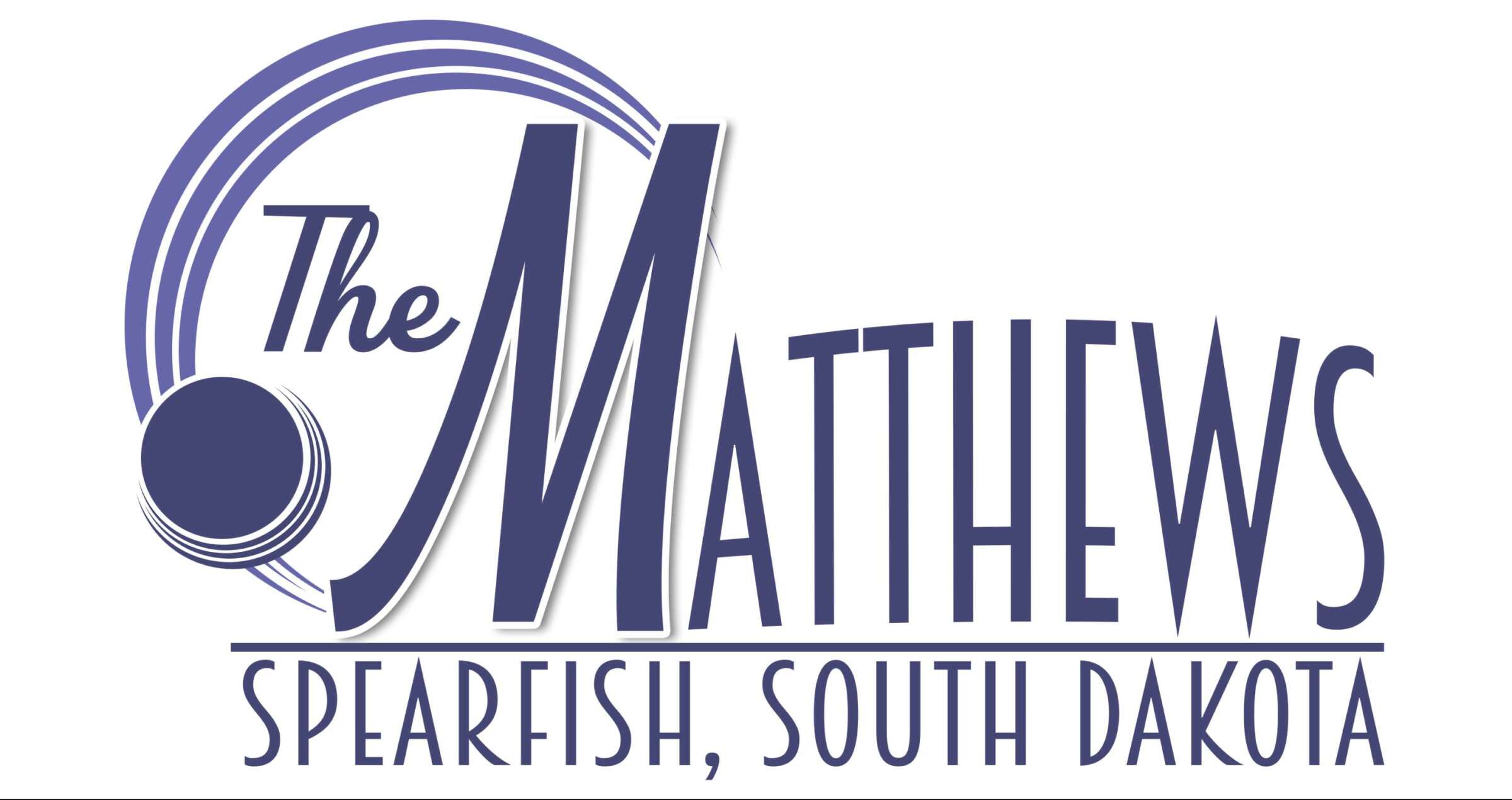

As The Matthews approaches 120 years of hosting the arts in the Spearfish community, we are so excited to share our new logo! The new logo is more than just a fresh design; it’s a symbol of the creativity, passion, and community spirit that define the Matthews as an entire organization. Whether you’ve attended a performance, explored our gallery, visited the Festival in the Park, or participated in one of our programs, our mission has always been to inspire creativity and connect with the community.
A Note From the Designer
Tia Erin, our Visual Arts Coordinator, crafted the new logo and has a bit to share about this creative venture:
I am so excited to see this facility continue to grow to meet the needs of our evolving community. From my own experiences, I know how The Matthews is a strong component in inspiring success. I began exhibiting my work in the gallery while I was a student at BHSU and started working here as an intern. Three years later, I have now been entrusted with the gallery, marketing, and the overall visual presentation of the Matthews to the community. My goal was to create a design that featured the Matthews as a whole facility beyond performances and exhibits because we are that and so much more! Our ability to share our space with local organizations and people to provide key resources to the community and help see those success stories unfold is what makes me the most excited about the future of the Matthews!

Why the Purple Circle?
Looking at the previous logo, there are key features that we kept in the new design. One being the purple circle. The symbol of the purple circle for the Matthews is one of unity and creativity. Purple is a color of imagination due to its combination of red’s energy and blue’s calmness, creating a color that stimulates creativity while also promoting a sense of peace and introspection. The circle is a symbol of unification and wholeness. At The Matthews, we strive to be an art center that facilitates inclusive and accessible art for everyone in a variety of forms. With a long history in the community, it is our mission to continue offering space for the community to come together to explore its creative nature and celebrate the arts in the Black Hills.
The font choice was also taken into heavy consideration. It was chosen by looking at poster designs from the past several years and seeing what styles and features were used the most, and it is no surprise that it generally fell to a 1920s Art Deco style. When you look at designs from the 1920s, the most noticeable feature is the clean elegance. That is also how the previous Matthews logo was described during its creation, and that was kept in mind for the new design. Art Deco came around in a time of technological progress, social changes, and dreams of great opportunity. In 1919, the opera house followed that trend and began to show silent movies on a fresh 9’x12’ screen, but by 1930, the opera house started to see a decline during the Great Depression and instead of housing the arts it was used to pack parachutes, act as a shooting gallery, or even extra room for a mortuary. But with resilience and tenacity, the Matthews came back and continues to rise to meet the same dream we had in the 20s: to inspire creativity and connect with the community.
What’s Next?
This new logo is just the beginning! We’re excited about what the future holds and can’t wait to continue bringing incredible performances, inspiring art, and engaging programs to Spearfish. Stay tuned for more updates, and as always, thank you for being part of our journey!